Source Selector
Source Selection blocks are N by 1 routers (where N represents the number of sources) with level control per input and optional logic input and output connections. Source Selection blocks are useful when remote control of audio source selection is required.
When the user first places a Source Selection block into a Tesira layout, this prompts an initialization window.
Source Channel Count specifies the number of input channels and generally corresponds to the number of sources from which the user can choose.
Enable Stereo creates a separate left and right channel for each input, as well as the output.
Enable Logic provides a logic input and output connection point for each channel.
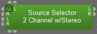
Source Selection is represented in the layout as a block with a number of audio input connections (specified by the Source Channel Count parameter), one audio output connection, and optionally, a logic input and output connection point for each channel. If logic is enabled, a low-to-high logic transition (i.e., a rising edge) presented to a logic input connection will cause the Source Selection block to switch to the corresponding audio input channel, and the corresponding logic out connection will be at a logic high. All other logic outputs will be low.
DSP Block Representation
More information on logic is located here:Source_Selection
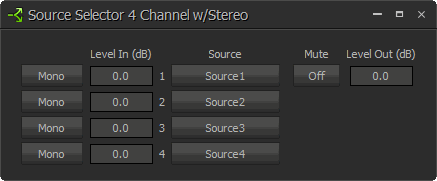
Control Dialog
Mono is used to designate an input as a mono (single-channel) input. This button is only available if the block is in Stereo mode. When selected, the right channel of the input will be grayed out and the mono signal should be connected to the left input. If a mono source is selected, it will be sent equally to both the left and right outputs.
Level (dB) adjusts the level (-100 to 12 dB) of the source connected to that channel’s input.
Source buttons are used to select the input source that is routed to the audio output connector of the Source Selection block. Only one source can be selected at a time. If the user right clicks a source selection button, this produces a dialog box that allows customization of the text that is displayed on that button. This dialog box can be minimized to create user control surfaces (see Customizing Component Objects).